Mar 19, 2019
4min read
SAFETY [FIRST]
The system being developed must align with user needs and incorporate key aspects such as Usability, Learnability, Efficiency, and Safety. When using an application, users should be able to solve problems efficiently, understand the interface easily, and feel safe while interacting with it.
But how can we identify potential issues within the interface that might lead to slips and mistakes?
To address human errors, safety measures are essential. These ensure that users can recognize their mistakes and understand how to correct them, ultimately improving their overall experience and preventing future errors.
Most of us have likely heard the term Human Error before. But do we truly understand what it means?
Human Error refers to a mental or physical condition that causes an activity to fail in achieving the desired outcome.
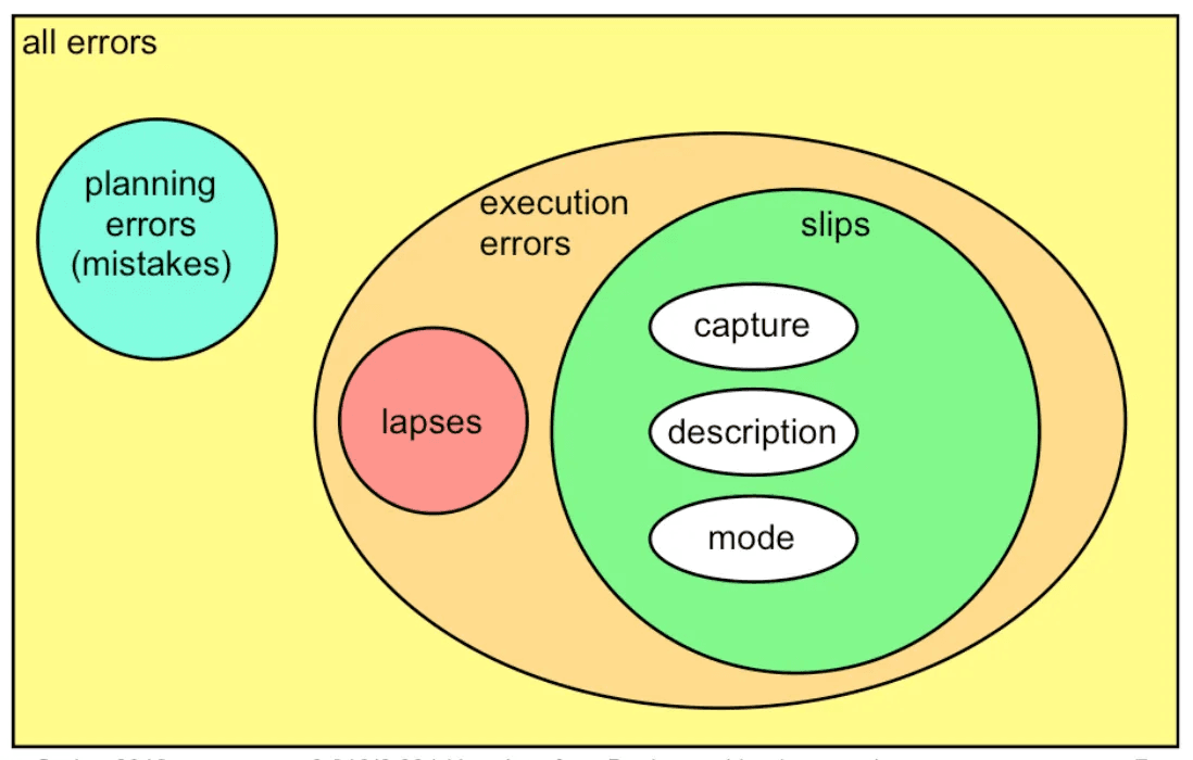
This type of error can be classified into Slips and Lapses and Mistakes, depending on how the error occurs.
What Differentiates Slips, Lapses, and Mistakes?
Slips and Lapses occur in individuals who already possess the necessary skills but make execution errors while performing a learned procedure.
Example: Moving a pointer with a mouse and clicking a button are learned procedures.
A Slip happens when a user clicks the mouse before the pointer is correctly positioned on the button.
In other words, Slips occur due to errors in the execution of an already learned procedure.
Slips and Lapses are distinguished based on the source of the error, while Mistakes occur due to errors in decision-making rather than execution.
Slip Failure of Execution
Lapse Failure of Memory
A Mistake is an error that occurs during planning or rule application. It happens when there is a misjudgment in decision-making, often based on habitual knowledge or incorrect assumptions.
Example: Using a rule in a situation where it should not be applied.
Unlike Slips and Lapses, which are execution errors, Mistakes stem from flaws in understanding, reasoning, or rule application rather than a failure in carrying out an action.

Capture Errors
Capture Slips occur when a person starts executing a sequence of actions but unintentionally switches to a different, familiar sequence.
Many of us have likely experienced this before.
Example: In Excel, an array formula must be executed by pressing Ctrl + Shift + Enter.
However, a user might instinctively press Enter alone because they are habitually used to completing actions with Enter.
This type of error happens when a well-practiced routine overrides the intended action, leading to unintended mistakes.
Description Errors
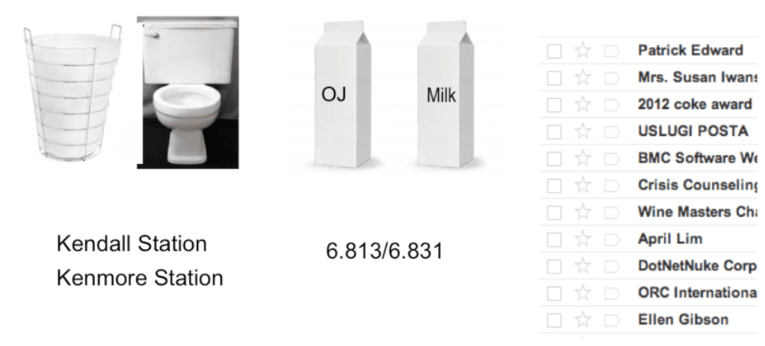
Description Slips occur when an action is performed on the wrong object due to similarities in appearance, shape, or function.
A classic example of this is:
You open the fridge to grab a carton of milk to pour into a bowl of cereal.
However, because the milk carton and juice carton are placed close together and look similar, you accidentally grab the juice and pour it instead.
This error happens because the objects involved share visual and functional similarities, leading to confusion and unintended actions.

ERROR PREVENTION
Errors in a system are unprofessional when visible to users but can be replaced with error messages.
Safety from Capture Errors: In a computer interface, users can prevent capture errors by avoiding sequences of actions that have the same initial steps.
Safety from Description Errors: Description errors can be minimized by ensuring that "dangerous functions" are separated from commonly used commands.
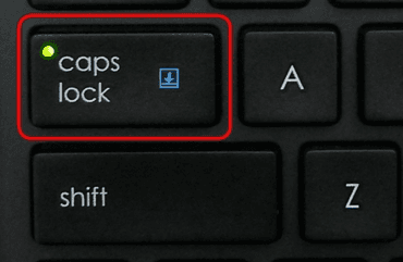
Safety from Error Modes: When error modes occur, users do not actively focus on the mode, as they do when interacting with controls. Therefore, the mode status should be visible within the user's locus of attention. This is why the Caps Lock light on a keyboard is not always effective—users may still forget that they have pressed the Caps Lock button.

Confirmation Dialog
In essence, confirmation dialogs can reduce the efficiency of an interface. For example, they often appear when users delete something, forcing them to click twice for each deletion. Therefore, providing an Undo option is a better solution for web interfaces. However, some actions are difficult to reverse and require user confirmation.
ERROR MESSAGE
Errors can be found in hardware, software, and even operating systems, making error messages a common aspect of computing. Error messages serve as reminders for users about issues that occur.
The way error messages are displayed varies, though most commonly, they appear in dialog boxes, notification icons, or status indicators.
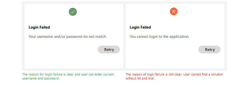
A well-designed error message should clearly inform users about the issue, explain why it happened, and provide a solution to resolve it. The goal is to guide users in adjusting their input or actions so the system functions as intended.
When displaying an error message, it should never make the user feel entirely at fault for the issue.
So.. How to Write Good Error Messages?
Error Messages Must Be Clear
Write error messages in clear and simple language. Users should immediately understand the issue when reading an error message. If the message is ambiguous and difficult to understand, it can negatively impact the product.

2. Concise and Meaningful Messages
Error messages should provide only the necessary information, as users don’t have much time to read. Ensure the message clearly explains the issue and how to resolve it in a concise yet effective way.

3. Don’t Blame the User!
A good error message uses polite and considerate language to communicate the issue without making the user feel at fault for their actions.

4. Provide Guidance to the User
A good error message consists of three parts: identifying the problem, explaining its cause, and offering a possible solution. Whenever an error occurs, users want to fix it as quickly as possible. Therefore, error messages should include enough information to guide users toward a resolution.

Therefore, an application should meet the requirements of usability, learnability, efficiency, and safety to ensure that users can easily navigate and enjoy using it.
Hopefully, the explanation above provides some insight into human error and how to design error messages that prevent users from feeling frustrated or overwhelmed.

